MENU
SHARE
Top 7 reasons I love ProPhoto 6

I’ve had ProPhoto a little over 3 years now. I have used versions 4, 5, and now for the last 6+ months version 6. When I first made the upgrade I wrote about it here the day I made my new site live. Every single issue I initially had has been solved and I am eagerly anticipating the next major update coming soon. The team over at ProPhoto just redesigned their own website using P6, so if you haven’t checked it out pop on over and do so. I won’t go to much into ALL that is can do, they have videos and tutorial links here that do that already. Instead I will just list the top 7 reasons I love ProPhoto 6, because I love lists!
100 % Responsive
This is the biggest difference between 6 and it’s predecessors. No need for a separate mobile site, everything just adapts to the current screen it is being viewed on. There are ways you can choose to limit what is shown on the different screen sizes (phone, tablet, laptop, and desktop), but it is not necessary. The last piece of the puzzle for me was getting my Vimeo embedded videos to be responsive. I had to create one for each screen size but last month I was able to eliminate the duplicates when I found this solution by Dawn Alderman. If she was in front of me I would kiss her because now the site truly is 100% responsive for my needs. There are now P6 video widgets that are completely 100% responsive for Vimeo/YouTube videos. I am still using the solution above for embeds inside a post.
Full-screen image galleries and backgrounds
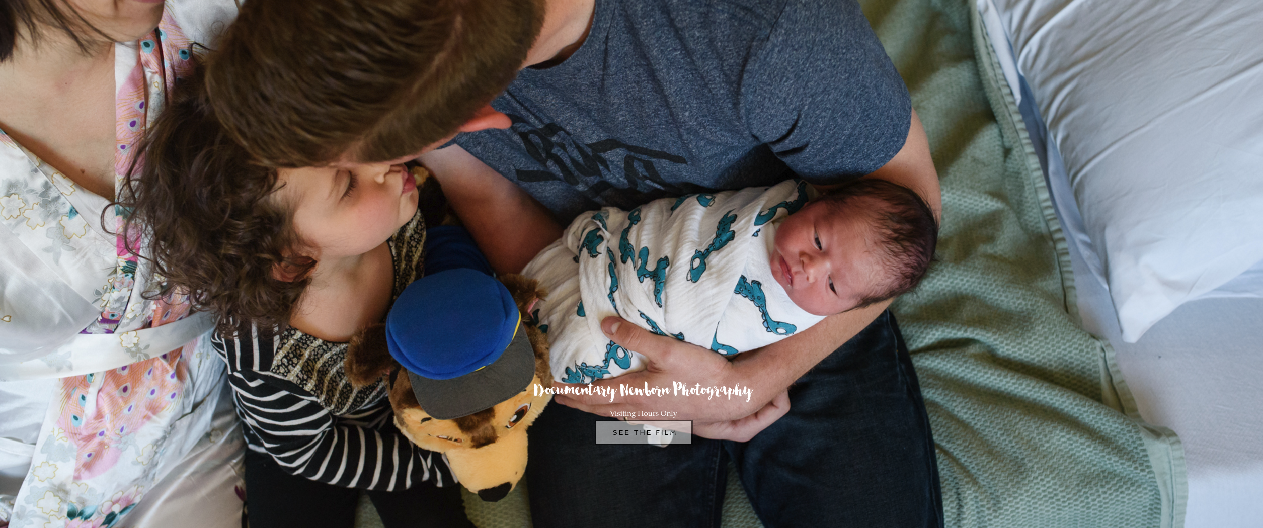
The only thing better than seeing my work is seeing it LARGE. I love that not only can you have images that are fullscreen you have have slideshows that are as well. Portfolios : Newborn Family
Templates
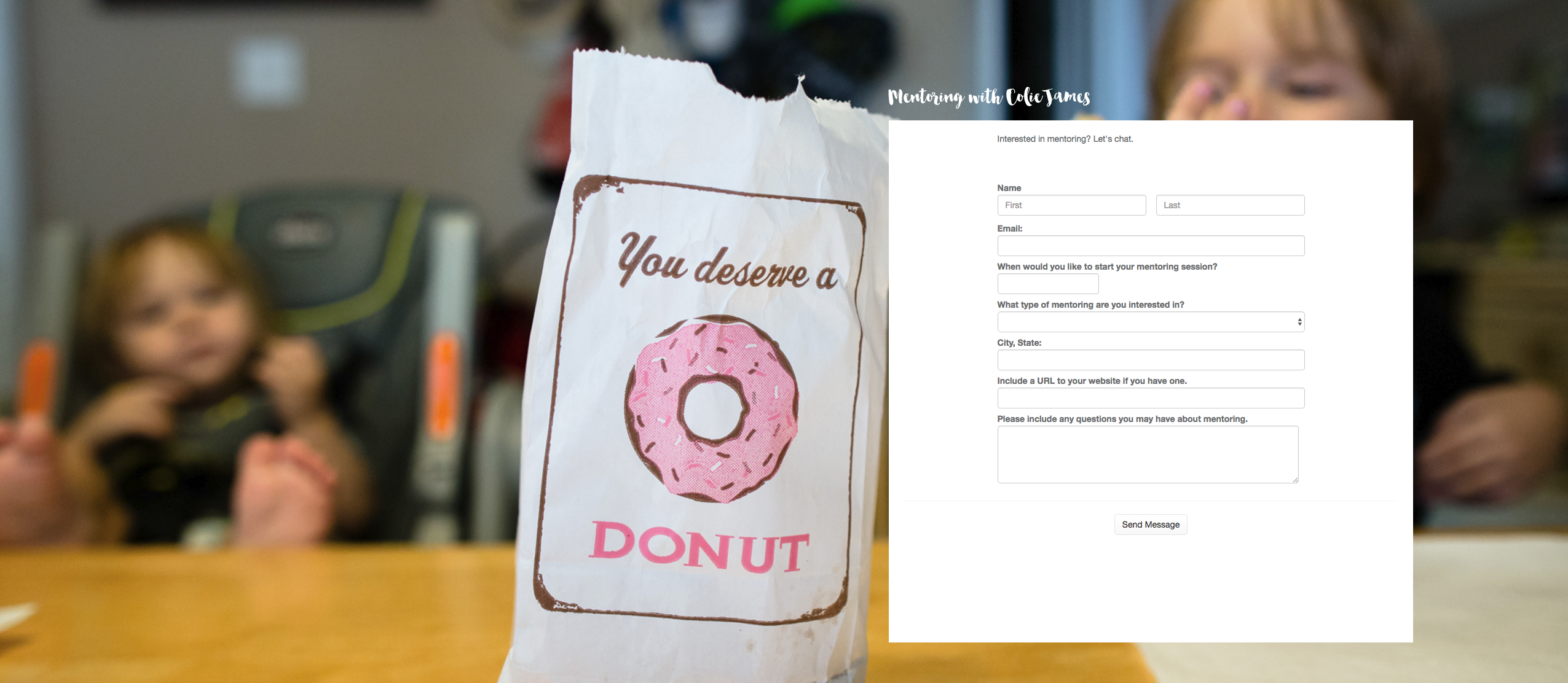
This is what makes it all possible to have different features across your site. You can have a horizontal centered menu on your main page and vertical menus everywhere else. Variations of header images or footers across your site. Each page has the capability of being unique, you simply assign it the template you want it to use. You build blocks with the features you want. Here are a few examples of a block in a template.
Parallax Images
This is what I was most excited about for ProPhoto 6. I may have gone a *little* overboard in May when I designed this site. I had full-screen parallax images on every main page linked from the menu. Figuring out how it works and finding images in my portfolio that made good candidates was a little tricky.
Tiles
Buttons from previous versions are now tiles. You have a lot more flexibility in where to place them. Building on everything I named previously tiles can be used on top of slideshows or scrolling over full-screen images.
Grids
These are still my favorite thing about ProPhoto and it is the main reason I started using a ProPhoto template years ago. You can have image grids, post/page grids, and they are 100% responsive as well. These are not new to P6, just a bit more flexible to setup.
Awesome Customer Service
If they do any kind of tabulation of how many emails come from a particular user I am sure I am high on the list. While they do keep banker hours ET getting a response from them is worth the wait. Even if the issue did not end up being a ProPhoto issue they have always been helpful in solving the problem.
Take a peek around the blog. I customized this site from the free starter template Morgan. ProPhoto has a 110% Money Back Guarantee. If you decide to buy here is a code for $10 off. CJAM9499
Example blocks
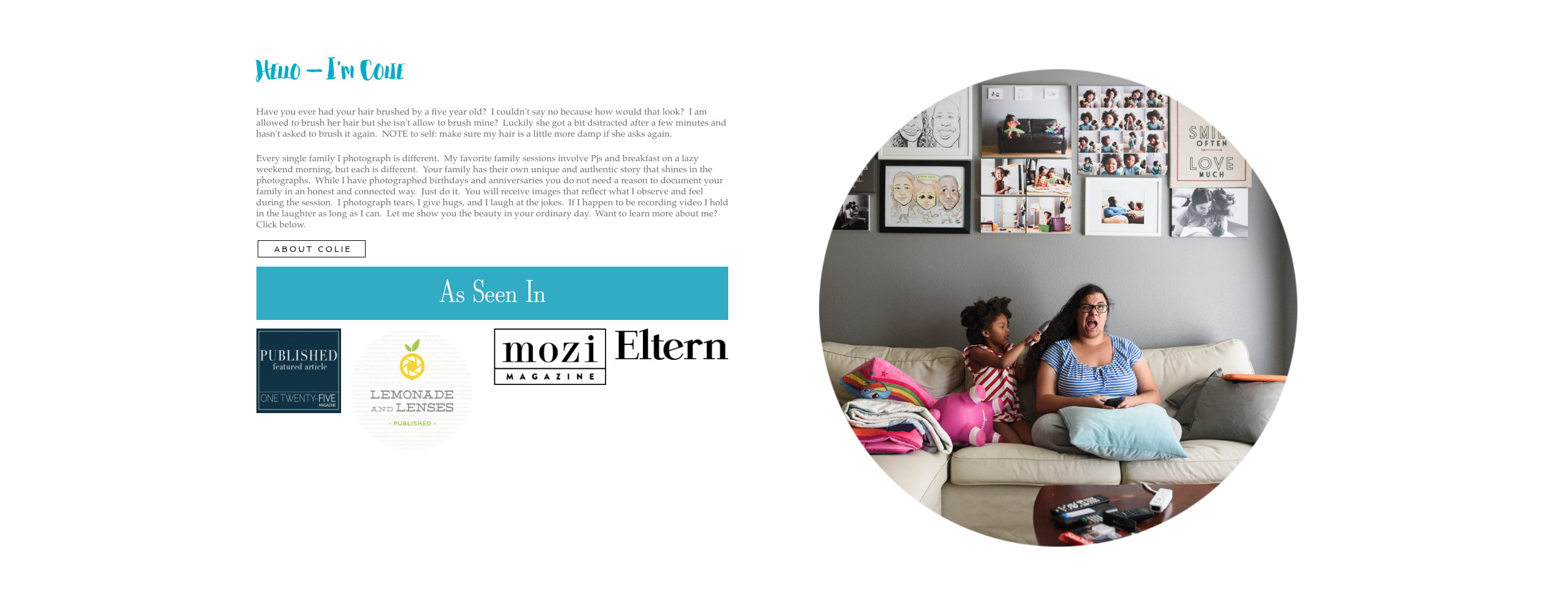




Why do you love ProPhoto 6 Colie?


back
to blog
explore
newborns
Families
Tips for Clients
Family Films
Family Films
Tips for Clients
Familes
newborns
explore
Newborn Snuggles
Stress-Free in-home Family Photography Sessions
Newborn Photos in a Pandemic




Tips for Clients
denver, dallas
& worldwide
